Tips for Choosing Calm Colors for Your Home Decor
Creating a peaceful and inviting atmosphere at home often starts with the colors you choose. Calm colors have the power to soothe the mind, reduce stress, and bring harmony to your living spaces. Whether you’re repainting a single room or planning a full home makeover, selecting the right colors can make a huge difference in how comfortable and relaxed you feel in your home.
In this post, we’ll explore practical tips for choosing calm colors that suit your style and space.
Why Choose Calm Colors?
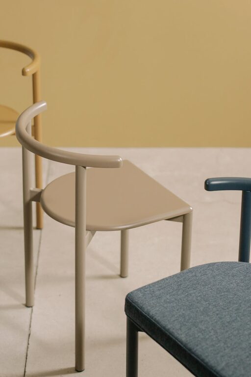
Calm colors tend to have a soft, muted, or neutral quality that helps to tone down visual noise. Unlike bright or highly saturated hues, calm colors promote tranquility, which can improve focus, rest, and overall well-being.
Typical calm colors include:
– Soft blues
– Warm beiges
– Gentle greens
– Pale grays
– Muted lavenders
When incorporated well, these colors can transform your home into a restful retreat.
—
Tip 1: Understand the Mood You Want to Create
Before selecting a color, think about the feeling you want in the space. Different calm colors evoke different moods:
– Blues suggest peace and can lower blood pressure, ideal for bedrooms or bathrooms.
– Greens symbolize nature and renewal, great for living rooms and kitchens.
– Beiges and warm neutrals create a cozy, welcoming ambiance, perfect for common areas.
– Soft grays provide a modern, sophisticated calmness suited for offices and lounges.
– Lavenders and pale purples bring a gentle sense of calm and creativity, good for reading nooks or bedrooms.
Matching the color to the intended mood ensures your space not only looks calm but feels calm too.
—
Tip 2: Consider the Lighting in Your Home
Lighting plays a crucial role in how colors appear. Natural light can make calm colors feel brighter and more cheerful, while artificial light might warm or cool tones differently.
– Rooms with lots of natural light: You can choose cooler calm colors like soft blues and greens, as they won’t feel dull.
– Rooms with less natural light: Opt for warmer shades like beige or soft yellow-beige to keep the room feeling bright and uplifting.
Always test paint samples on your walls at different times of day to see how lighting changes the color.
—
Tip 3: Use Color Samples and Test Swatches
Buying a sample and painting a small section of your wall is one of the best ways to know if a color is right for you. Observe the swatch during different times—morning, afternoon, and evening—to get a full picture of the hue’s behavior.
Try to view the colors in context with your furniture, flooring, and décor. Sometimes, colors look different next to certain materials or fabrics.
—
Tip 4: Create Balance with Neutrals and Accent Tones
Calm colors often work beautifully when balanced with neutrals such as white, off-white, or soft gray. These combinations keep your room feeling open and uncluttered.
You can also add subtle accent colors to add interest without overwhelming the calm vibe. For example:
– A pale blue room with crisp white trim
– Soft green walls complemented by cream furniture
– Warm beige walls paired with muted coral or dusty rose accents
This layering approach adds depth and personality while maintaining serenity.
—
Tip 5: Consider the Finish of Your Paint
The texture and finish of your paint can affect the overall calmness of a room.
– Matte finishes tend to absorb light and reduce glare, making walls feel softer and enhancing a calm atmosphere.
– Satin or eggshell finishes are slightly reflective and easy to clean, great for high-traffic areas but still subtle.
– Glossy finishes may not be the best choice for calm rooms since they reflect light strongly, which can be too stimulating.
Select a finish that fits the room’s function and your lifestyle while supporting the calm aesthetic.
—
Tip 6: Think About Color Psychology
While personal taste is key, understanding basic color psychology can help in making informed choices. Here are a few ideas:
– Blue: Calming, promotes sleep and relaxation.
– Green: Refreshing and harmonizing, reduces anxiety.
– Beige and tan: Warm, welcoming, and grounding.
– Gray: Neutral and balanced, but too much can feel cold.
– Lavender: Soothing and gentle, promotes peacefulness.
Use this knowledge as a guide rather than a strict rule to tailor the colors to your preferences.
—
Tip 7: Coordinate Calm Colors Throughout Your Home
For a cohesive and calming flow, consider using a color palette with variations of related calm hues throughout your home. For instance, you might have a soft green in the living room, pale blue in the bedroom, and warm beige in the kitchen.
This creates a sense of connection between different spaces while keeping the overall atmosphere soothing.
—
Tip 8: Don’t Forget Textiles and Accessories
Paint is just one part of the color story. Cushions, rugs, curtains, and artwork can reinforce or contrast with your calm paint colors. If your walls are painted in a calm neutral, try adding textiles in soft blues or greens to introduce subtle color and texture without disrupting the peace.
—
Final Thoughts
Choosing calm colors for your home is a wonderful way to create a relaxing sanctuary. By understanding your mood goals, accounting for lighting, testing samples, and balancing colors wisely, you can design a space that feels both peaceful and welcoming.
Remember, calmness is personal, so trust your instincts and enjoy the process of making your home a haven.
—
If you found these tips helpful, consider sharing your calm color choices or questions in the comments below!